How Jeanne Gang married soaring wonder, structural necessity at Gilder Center
Leading architect discusses her embrace of organic in design, need to acknowledge climate change
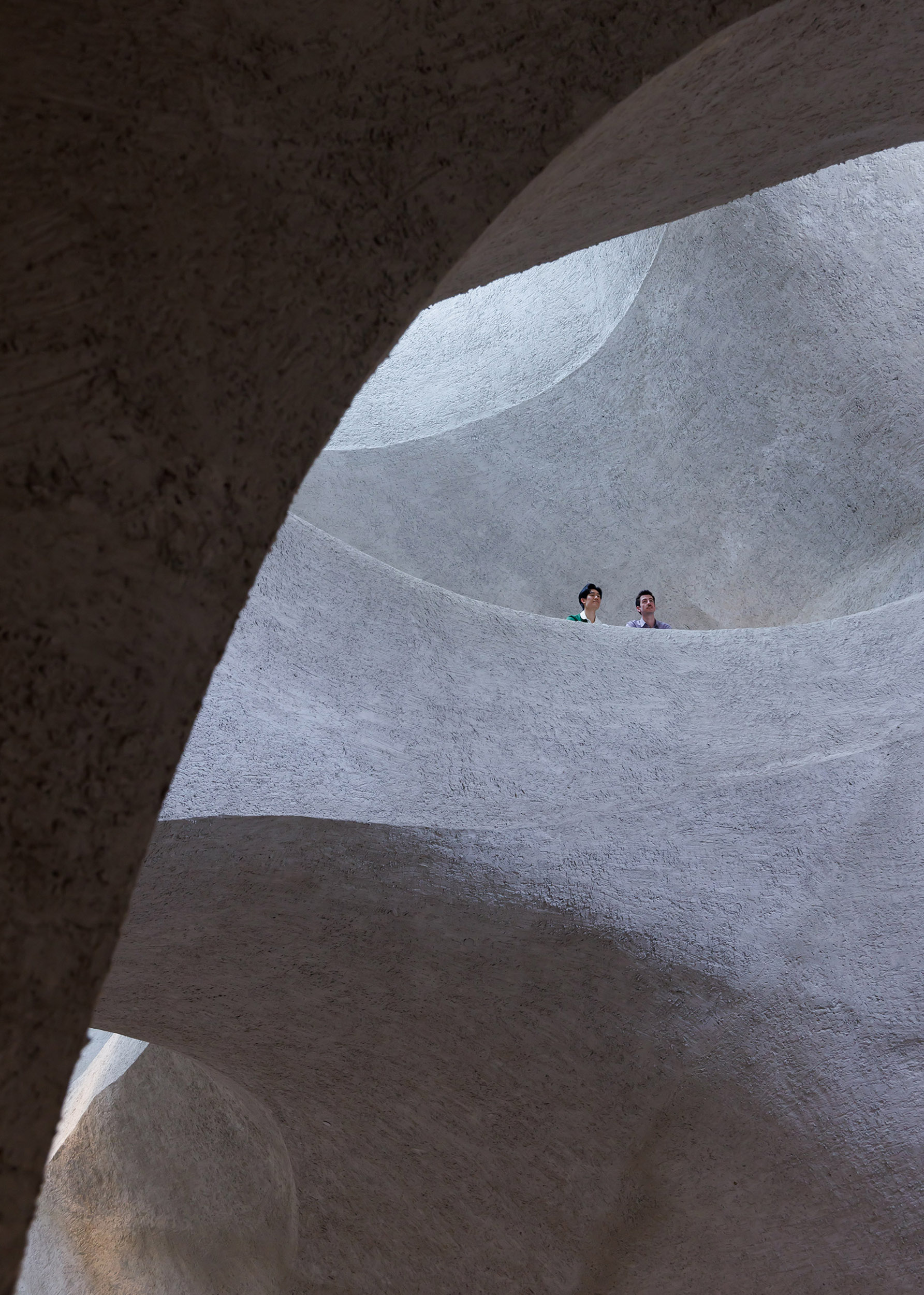
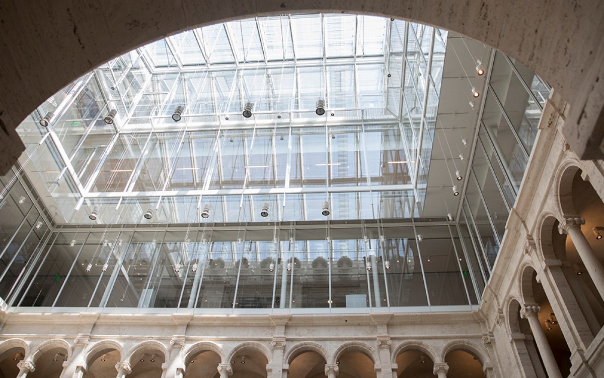
Looking up to the fourth-floor bridge of the Gilder Center.
© Iwan Baan
It’s fairly rare when a venerable, beloved institution like the American Museum of Natural History in New York City undergoes a major, multiyear expansion that makes both critics and the public happy.
Somehow, that’s what Harvard Graduate School of Design’s Jeanne Gang, one of the world’s leading architects, managed to pull off at the museum’s new Richard Gilder Center for Science, Education, and Innovation with her architecture and urban design firm, Studio Gang.
The $465 million center, which opened in May, added six floors and 230,000 square feet for new exhibition galleries, classrooms, a library and theater, an insectarium, and a conservatory where 1,000 butterflies fly freely. With a dramatic, canyon-like atrium that snakes upward and looks as if it was carved from ancient river rock, the New York Times declared the Center a “spectacular” example of “poetic” public architecture that was “destined to be an instant heartthrob and colossal attraction.”
Gang’s colleague Gary Hilderbrand, the Peter Louis Hornbeck Professor in Practice of Landscape Architecture and chair of the department of landscape architecture at the Design School, and his firm Reed Hilderbrand, concurrently designed major improvements to areas of the adjacent Theodore Roosevelt Park.
The Gazette spoke with Gang, a professor in practice of architecture at Design School, about the project and how climate change is shaping her practice. Interview has been edited for clarity and length.

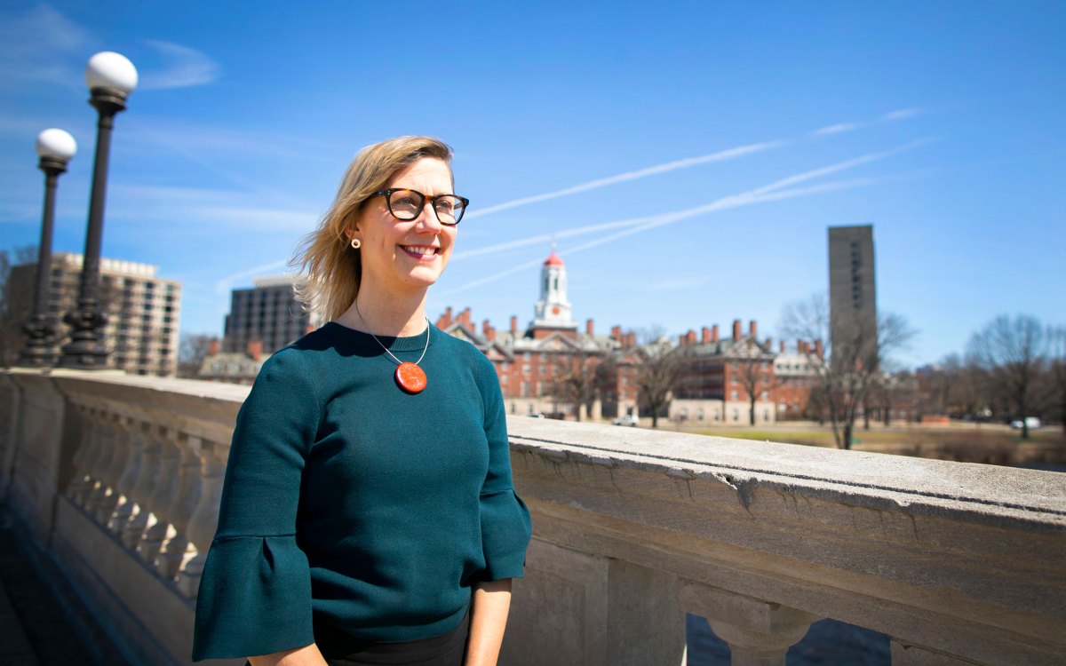
“We wanted to get people super excited about exploration and discovery,” Jeanne Gang said of the Gilder Center project. “I started thinking of landscapes that make you feel that way and looked at different kinds of natural formations in geology and researched how they’re made.”
Photo by Marc Olivier Le Blanc
Q&A
Jeanne Gang
GAZETTE: What were the museum’s primary goals for this project and what were the philosophies or ideas behind some of the key design choices you and your team made to accomplish those goals?
GANG: The American Museum of Natural History has always been an educational institution, not just for schoolchildren but also for adults and teachers. They have a Ph.D. program, too. It’s almost like a university, but for everyone of all ages. The museum wanted to support and highlight their educational mission as well as the breadth of their expertise.
Most of the exhibitions and collections on display are focused on a certain branch of natural history, like dinosaurs, gems and minerals, or earth and space. This is the first time they’ve built something that shows the extent of their collections, including ones that they’ve never been able to display before, like insects, and how they are used for scientific research. They really wanted to do something that would bring different aspects of their mission together, especially given that science education in the U.S. ranks lower than you would expect.
In addition to new collections and exhibition spaces, the Gilder Center includes multiple classrooms, learning laboratories, an expanded research library, and an immersive theater experience.
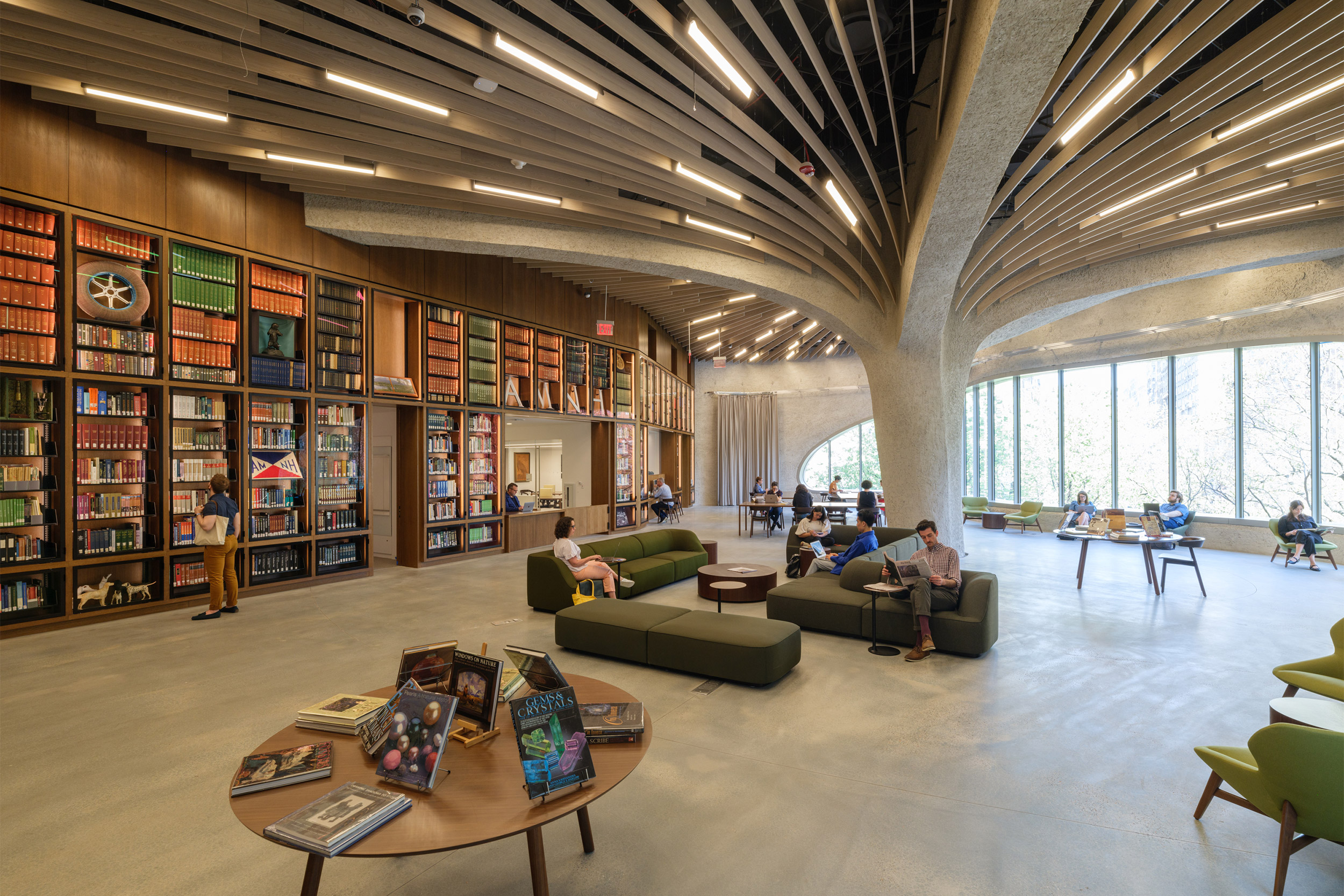
“In the new library, we designed a mushroom-like ceiling with a column in the middle of the space. That column had to be in that spot because it had to land exactly on the column below it. Normally, we wouldn’t put a column right in the middle of the space. But that’s where it needed to be, so we made something out of it.”
Photo by Alvaro Keding
The museum talks about “de-bricking the science,” making it physically and visually accessible to the public. Our design establishes a new visible and fully accessible entrance for the museum at Columbus Avenue. We wanted to get people super excited about exploration and discovery. I started thinking of landscapes that make you feel that way and looked at different kinds of natural formations in geology and researched how they’re made.
But the design was very contingent on certain factors. For example, we only had certain places where we could land the structure. How do you create structural walls and arches from fewer points? That’s how the form started to take shape. It’s almost like a canyon or cave that arches up and holds the loads of the new floors.
Another aspect of “debricking the science” involved responding to the building right next to our site, which housed many of the museum’s collections in literally a brick tower that was only accessible to curators and museum leadership. We took the brick wall off and extended the building into the Gilder Center, revealing its collections with a glass front that stretched over multiple levels, allowing visitors to see what goes on inside.
Sometimes there are researchers coming in, taking out a pair of antlers and scraping a little sample for DNA testing. Things like that are going on all the time. People can now get a glimpse of these exciting collections and how they’re used for scientific research.
To increase daylight, the classrooms’ windows open onto Theodore Roosevelt Park as well as the central atrium, which is lit through skylights that bring in natural light while reducing glare and harmful rays. That’s another reason for the Gilder Center’s canyon-like interior: It reduces glare and helps with acoustics, and at the same time, it holds up the building from the inside.
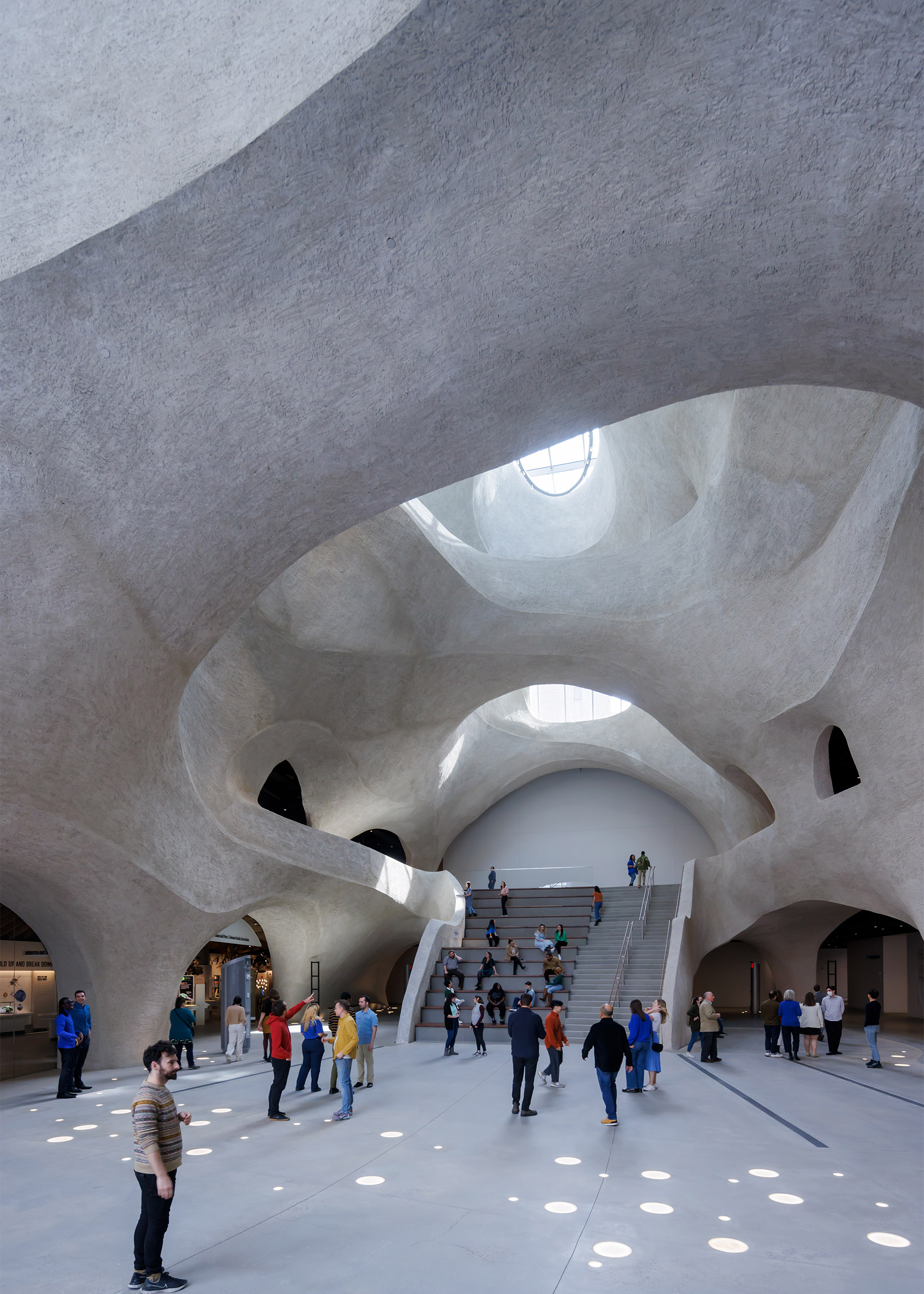
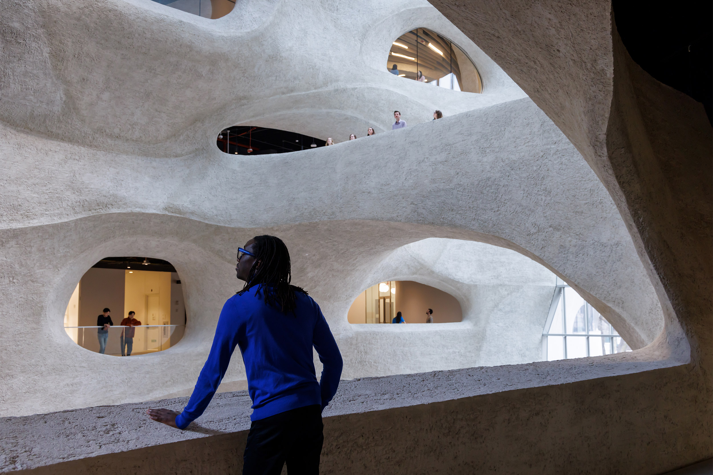
The atrium and view from second floor.
© Iwan Baan
GAZETTE: That atrium has elicited a lot of excitement for its unusual and unexpected design. Many visitors have remarked how they experience a sense of wonder as soon as they enter. Was that also part of your intention?
GANG: The design definitely aims to elicit people’s curiosity, and their sense of exploration and wonder. With more than 30 connections among 10 different buildings, the design invites people to explore parts of the museum that they might not have been expecting to see. They can follow their curiosity, giving them a sense of being an explorer, of discovering something new.
GAZETTE: The site presented a number of pre-existing challenges, or contingencies as you refer to them, that had to be worked through. Is that a common problem?
GANG: The Gilder Center sits on top of a basement level, which is the loading dock for the entire building. We couldn’t block that, so we had to make our columns land on the existing ones. In the new library, we designed a mushroom-like ceiling with a column in the middle of the space. That column had to be in that spot because it had to land exactly on the column below it. Normally, we wouldn’t put a column right in the middle of the space. But that’s where it needed to be, so we made something out of it.
That’s what I mean by contingencies. We started with what was already there. How can we make the best of this brick tower or this column? It’s a very organic way of working. Instead of imposing a grid on the design of the museum, we worked with its pre-existing condition and thought about the relationships between the different parts.
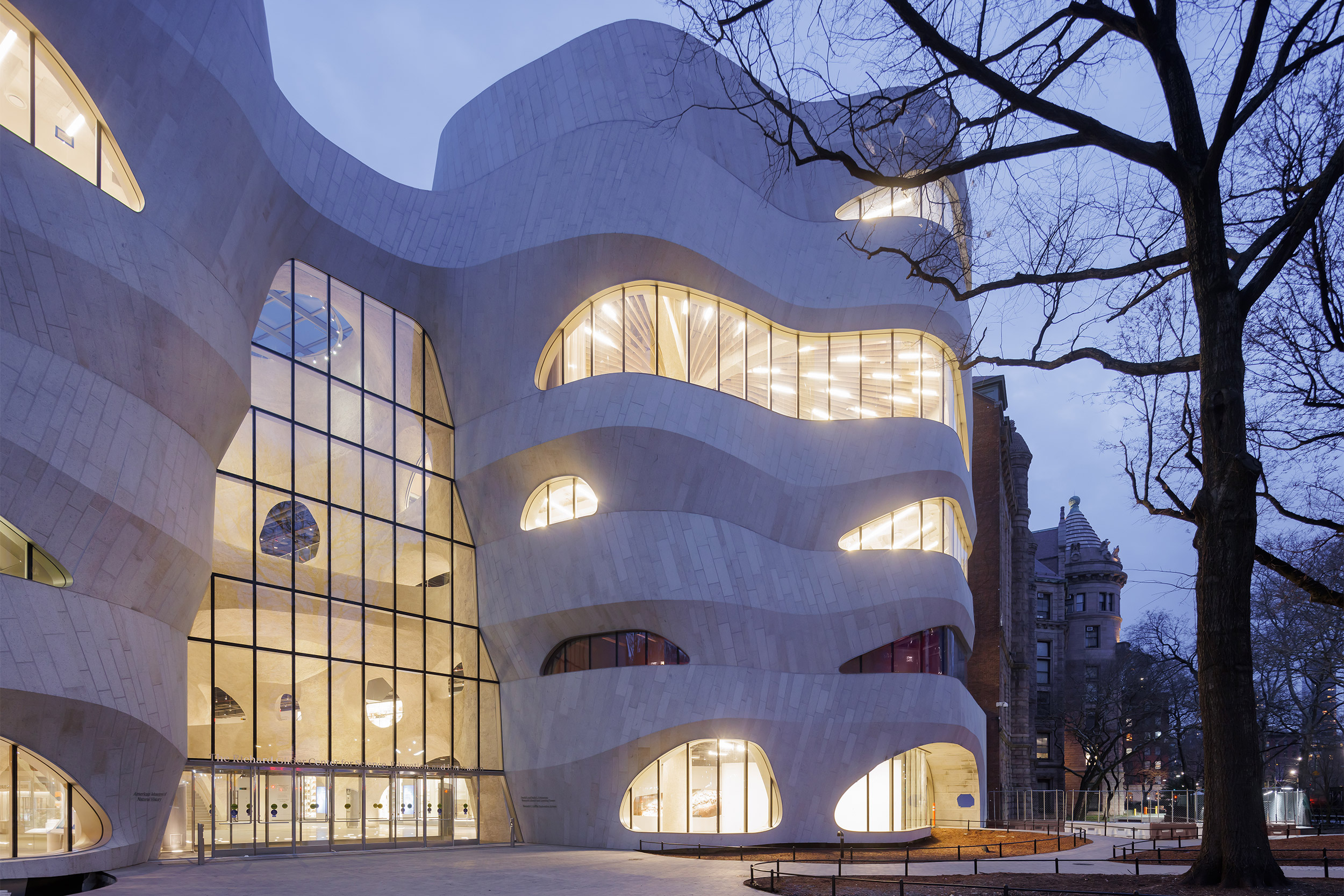
© Iwan Baan
A large part of what I teach at the GSD is adaptive reuse, and a lot of my studios are about trying to reuse existing structures in order to reduce carbon pollution and embodied carbon and thinking of creative ways to do so.
My last studio was about adding new uses on top of the existing parking garage of Peabody Terrace, designed by Josep Lluis Sert, in Cambridge. With the urgency of climate change and the need for reducing the embodied carbon of construction, that’s really where we can make the biggest difference now. It makes sense to reuse as much as we already have.
“It’s one of the few public places in New York City where you can comfortably hang out inside and be right on axis with the Manhattan grid.”
GAZETTE: How is climate change shaping your practice today?
GANG: Starting with which projects we choose to pursue, we look more critically at the site and the ambitions of the potential client to try to be on the same page. For a long time, we were always trying to coax every client along with responding to climate change and making greener buildings, sometimes successfully and sometimes not.
Now, we try to make more advances by working with people who are equally wanting to reduce carbon to address climate change, people who have projects that are taking that seriously.
The second is doing our own accounting of our past projects and learning, after they’ve been built, how successful they are in terms of their environmental performance. We’re developing our own database that measures and tracks this, and internally we’re learning a lot from that.
We’re also mindful of the materiality of each of our projects. The structure is the most carbon-intensive material of a building, so we’re trying approaches like mass timber that can dramatically reduce the carbon embodied in the structure. We are also proactively addressing the ecology of our sites and how to maintain and increase biodiversity across all our projects. That’s something we’ve always done, but it’s even more important now.
GAZETTE: There’s a motif of connection — between people or between people and the natural world — that seems to run through your work. Why is connection so important to you?
GANG: I always think of architecture as analogous to ecology, where it’s not about the object, but about the relationships that the objects help to set up; it’s about this network of relationships. That’s why I often talk about our work as creating or engendering positive relationships between people, but also between people and their environment, which includes nonhuman species, too.
With the Gilder Center, an important part of our design approach was making people of all ages and abilities feel comfortable, so we made sure that there was ample seating in the space as well as varying sightlines so that everyone could see and connect to the exhibits, to each other, and the park outside. We made sure to align the view from the central stairs in the atrium with the strong east-west street axis of Manhattan. It’s one of the few public places in New York City where you can comfortably hang out inside and be right on axis with the Manhattan grid. In that sense, the design is connecting people to the city that they’re in and even further beyond.
